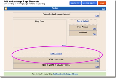
Would you like to have more room on your blog? The best way is to create more spaces to put your gadgets and such!
Resource: Pocket at Blogger Templates
The standard blog has one gadget area for the bottom of your blog.
Step 1 – Back up your template. The instructions are here.
Step 2 - Clear your footer space.
You will want to move all gadgets out of the footer area by clicking on the gadget and holding your mouse key and moving the gadget to the side for now.
Step 3 – Edit your HTML
Go to your HTML code by going to CUSTOMIZE-LAYOUT-EDIT HTML
By using your CTRL + F keys together, you can FIND this part of the code by copying and pasting it exactly into the search bar
]]></b:skin>
</head>
In the line directly above this section of code ADD THIS CODE:
#footer-columns {
border-top:1px dotted #999999;
clear:both;
margin:0 auto;
}
.column1 {
padding: 0px 5px 3px 5px;
width: 30%;
float: left;
margin:3px;
text-align: left;
}
.column2 {
padding: 0px 5px 3px 5px;
width: 31%;
float: left;
margin:3px 3px 3px 5px;
text-align: left;
}
.column3 {
padding: 0px 5px 3px 5px;
width: 30%;
float: right;
margin:3px;
text-align: left;
}
.addwidget {
padding: 0 0 0 0;
}
#footer-columns ul {
list-style:none;
margin:0 0 0;
padding:0 0 0;
}
#footer-columns li {
margin:0;
padding-top:0;
padding-left:0;
padding-bottom:.25em;
padding-right:15px;
text-indent:-15px;
line-height:1.5em;
}
body#layout #footer-columns {
width: 100%;
margin-left: auto;
margin-right: auto;
}
body#layout .column1 {
width: 32%;
float: left;
}
body#layout .column2 {
width: 32%;
float: left;
}
body#layout .column3 {
width: 32%;
float: right;
}
Click SAVE. You will not see any difference yet, we have to add the columns to the layout portion.
Step 4 – EDIT HTML AGAIN!
By using your CTRL + F keys together, you can FIND this part of the code by copying and pasting it exactly into the search bar
<b:section class='footer' id='footer'/>
You will DELETE this part of the code and ADD new code which is as follows:
<div id='footer-columns'>
<div class='column1'>
<b:section class='addwidget' id='col1' preferred='yes' style='float:left;'>
</b:section>
</div>
<div class='column2'>
<b:section class='addwidget' id='col2' preferred='yes' style='float:left;'>
</b:section>
</div>
<div class='column3'>
<b:section class='addwidget' id='col3' preferred='yes' style='float:right;'>
</b:section>
</div>
<div style='clear:both;'/>
</div>
<b:section class='footer' id='footer'/>
Click save.
Here is the Word Document of these instructions, and here are the video instructions. The video runs better after the first viewing.
Here’s to more happy scrapping, and
Hugs from the heart,
Jeanette


I have 3 columns, but wish the two flanking my blog posts were a little wider. Is there a way to do that?
ReplyDeleteThanks for all the tuts! I didn't use this particular tut, but have found many of your posts really useful! Check out my totally pimped out blog! Miss Erin's Scraps
ReplyDeleteHi hun, I have tried to follow your tut for Making Footer Columns, I get an error when I come to safe it at step four..The first part saves ok no problem, but when I come to save step four I get this message.... Your template could not be parsed as it is not well-formed. Please make sure that all XML elements are closed properly.
ReplyDeleteXML error message: Element type "b:section" must be followed by either attribute specifications, ">" or "/>".
I have typed it out as you have it but I keep getting this message...could you help please?? Thanks
It's important to delete the line of code in the second section...check that and see if that was the issue....I will email you also!
ReplyDeleteThis is amazing, nice lesson. Thank you.
ReplyDelete